Cabinet Faraday
- Year
- 2024
- Field
- Identity
- Role
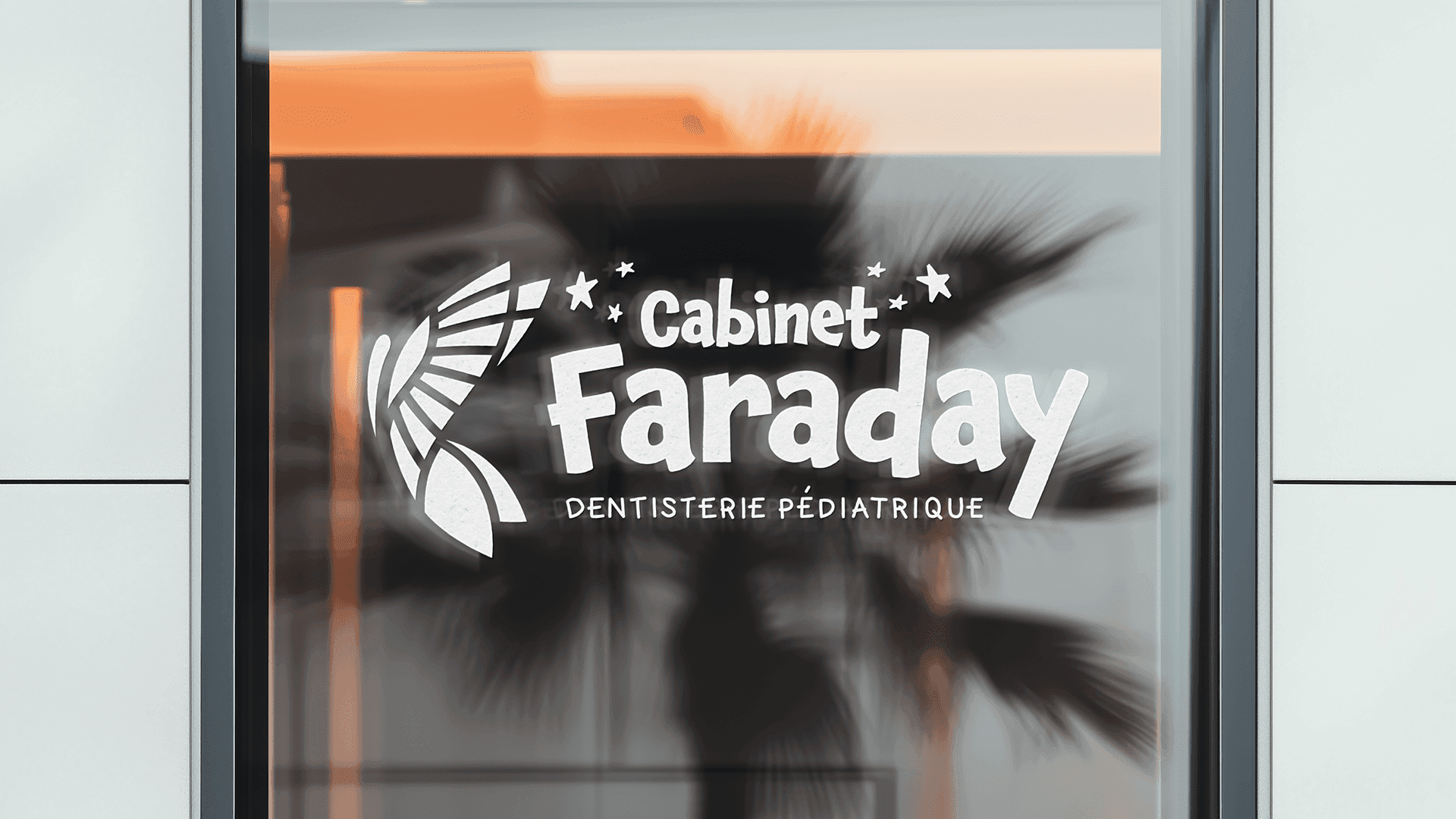
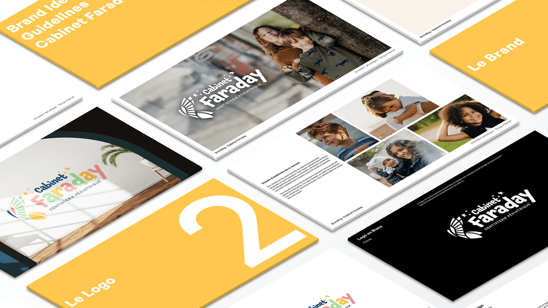
- Branding / Logo / Signage
Description
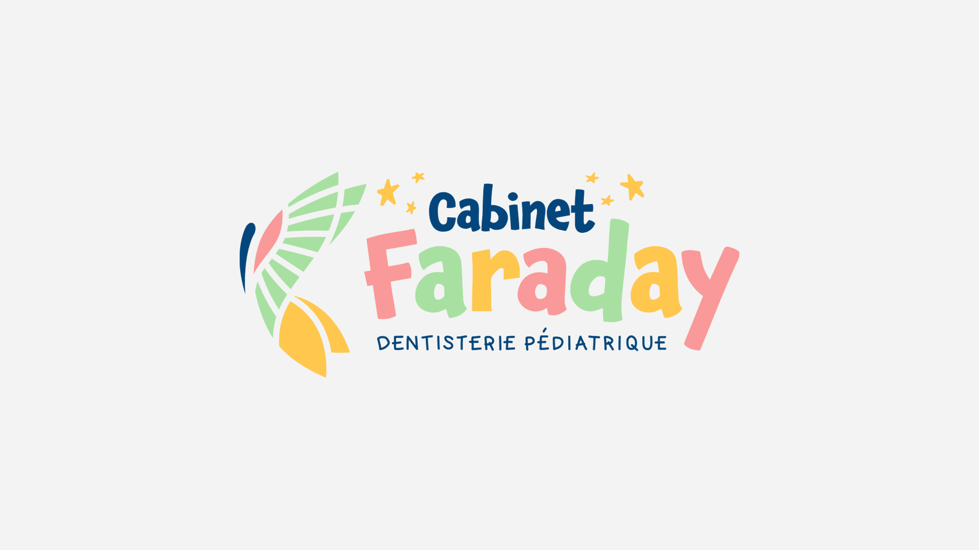
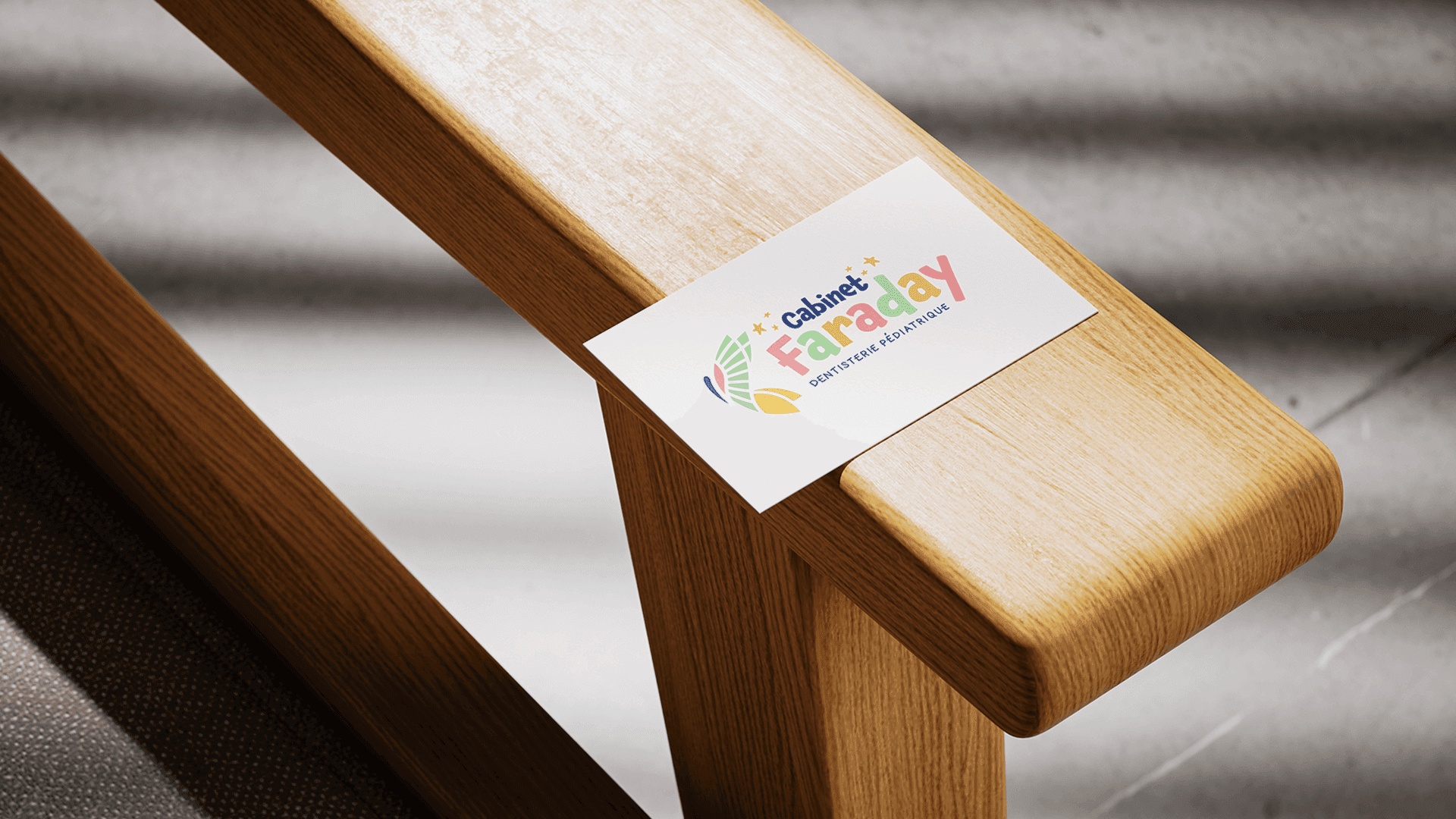
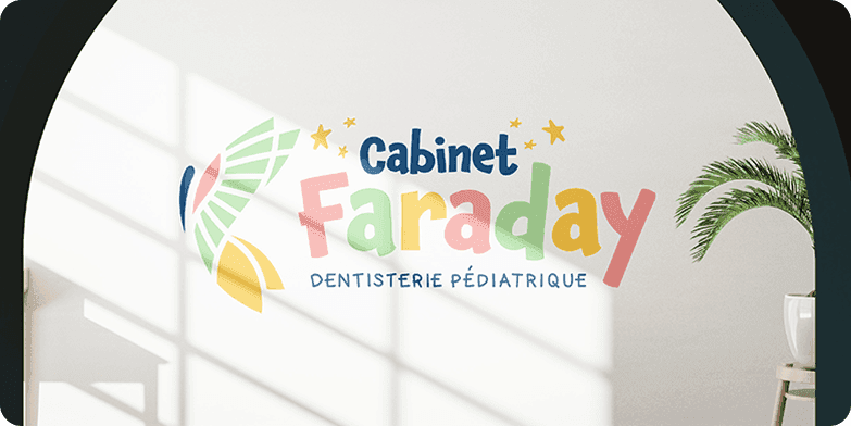
Cabinet Faraday was a creative challenge! While staying true to a brand identity consistent with the chosen colours for the practice's space, we had to design an identity rich in warm, Mexican-inspired hues — welcoming for families. The visual look may feel hand-drawn and spontaneous, but the colour choices are precise and the overall structure carefully built.
Tasteful graphic design
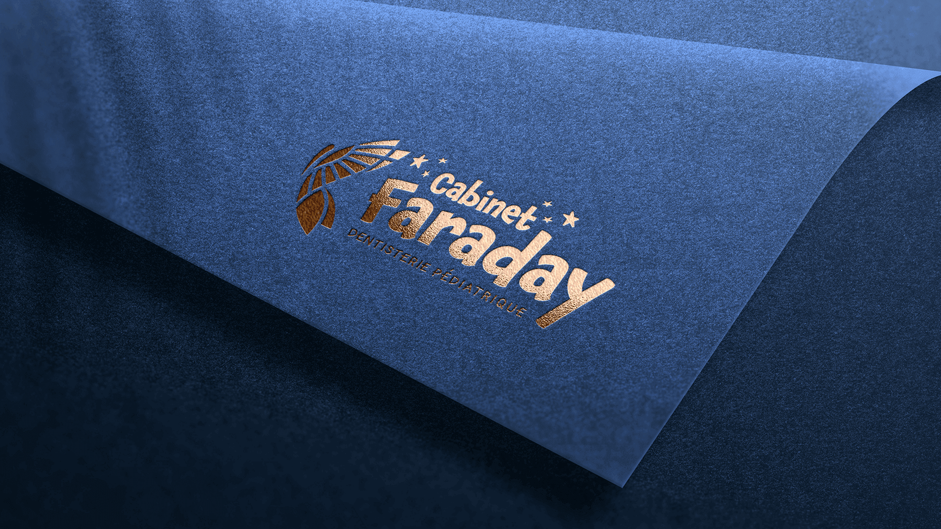
A vibrant colour palette and an identity that is warm, festive and raw at the same time were designed to dress a richly coloured space, while preserving the standing expected by a clientele from upscale Parisian neighbourhoods. Particular attention was paid to our client's target audience and her wish to evoke the atmosphere of haciendas in her brand world. The logo embodies this intent with expressive typography, raw forms and dazzling hues.
Got an idea to bring to life?
Tell us about your project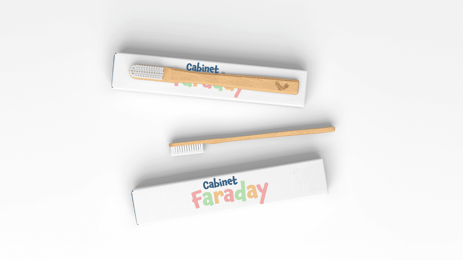
Client website
cabinetfaraday.frThey trust us
“A heartfelt thank you to Tanguy, from agency Kinome, who supported and guided me in creating the visual identity of my paediatric dentistry practice. Available, efficient, patient and passionate, he has every quality needed to help bring a creative project to life.”
You may also like